
Understanding scatter plots can be challenging for many students, but don’t worry! This guide is designed to simplify teaching scatter plots and support both educators and learners. It covers everything from interpreting scatter plots to analyzing data effectively, providing valuable teaching strategies along the way. Whether you’re an experienced teacher looking to refine your approach or a newcomer seeking guidance, this resource is here to help. Get ready to break down scatter plots and equip your students with the skills they need to master them!
How to Create a Scatter Plot
Creating a scatter plot is an essential data skill that helps students visualize relationships between two variables. The process begins with collecting the right data—each data point should consist of two numerical values representing a specific relationship. For example, if you’re studying the connection between study hours and test scores, you would gather data for each student, noting both their study hours and corresponding test scores. Once you have a complete dataset, you’re ready to move on to the next steps.
Understanding the coordinate system is crucial for constructing a scatter plot. This involves drawing two perpendicular axes: the X-axis and the Y-axis. Typically, the X-axis represents the independent variable, while the Y-axis represents the dependent variable. In our study hours versus test scores example, study hours would be plotted on the X-axis, and test scores on the Y-axis. Labeling each axis correctly and setting an appropriate scale ensures that all data points fit within the graph and are accurately represented.
With the axes in place, you can begin plotting data points. Each point corresponds to a pair of values, where the X-coordinate represents the independent variable, and the Y-coordinate represents the dependent variable. For instance, if a student studied for five hours and scored 80 on a test, you would plot the point at (5, 80). Make sure to tell students you do not connect the points on a scatter plot. Once all data points are plotted, the scatter plot provides a visual representation of the relationship between the two variables, offering valuable insights into their correlation.
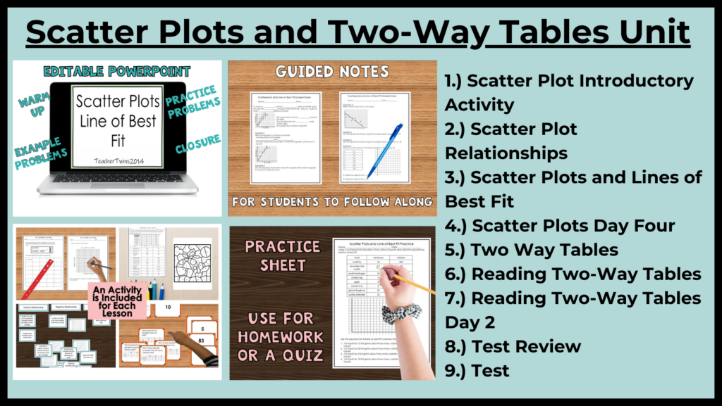
A great introductory activity for teaching scatter plots is having students measure their height and wingspan. Ensure that everyone uses the same unit of measurement, such as inches, for consistency. Students will record their measurements as ordered pairs (height, wingspan). Then, they will plot these pairs on a scatter plot, graphing the data for the entire class. This hands-on exercise helps students practice graphing while allowing them to observe and analyze the overall relationship between the two variables. Check out the Math Units below for lessons on teaching scatter plots.
Types of Relationships in Scatter Plots
Scatter plots are a powerful tool for visually representing relationships between two variables. The three most common types of relationships found in scatter plots are positive correlation, negative correlation, and no correlation. A positive correlation occurs when both variables increase together—for example, as study hours increase, test scores tend to improve. This relationship appears as an upward trend from left to right on a scatter plot.
On the other hand, a negative correlation occurs when one variable increases while the other decreases. For instance, as exercise levels rise, body weight often decreases. This inverse relationship is represented by a downward trend on the scatter plot. Identifying these patterns helps in understanding the connection between variables and interpreting data effectively.
In some cases, there is no clear relationship between the two variables, resulting in a scatter plot with randomly distributed points. When data points do not form a distinct pattern, it indicates that changes in one variable have little to no effect on the other. For example, the relationship between shoe size and intelligence would likely show no correlation, as the data points would be scattered without a predictable trend. Recognizing these different types of relationships is essential for analyzing data and drawing meaningful insights.
A good activity to help students understand data relationships is to provide them with various data pairs and have them classify them into one of three categories: positive correlation, negative correlation, or no correlation. For example, the relationship between the amount of ink left in a printer and the number of pages printed is negative— as more pages are printed, the ink supply decreases. Once students have sorted the data, review their classifications as a class. This activity not only reinforces their understanding but also provides an opportunity to address any misconceptions.

Analyzing data in scatter plots
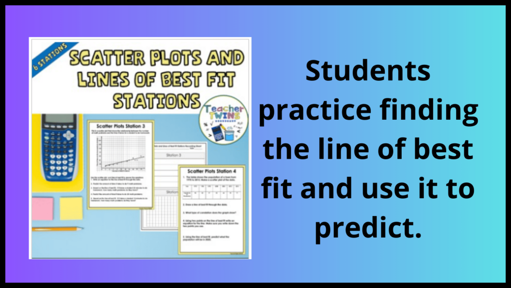
A line of best fit helps analyze data in a scatter plot by identifying trends. To determine this line using two points from the graphed dataset, first, select two points that best represent the data. Ideally, they should be near the middle of the data, not too far above or below the majority of the data. Next, calculate the slope using the two points. Once the slope is found, use it along with one of the selected points to write the equation of the line. This equation serves as an approximation of the relationship between the variables, allowing for predictions and trend analysis.
In a scatter plot, students can select different ordered pairs to represent the data. Comparing the equations derived from these points helps analyze variations in the rate of change and y-intercepts. By examining these differences, students gain a deeper understanding of how data trends can be interpreted. To ensure consistency, demonstrate how to use a graphing calculator to calculate the linear regression line, which provides a standardized equation for analyzing the data accurately.
Provide students with opportunities to practice finding the line of best fit through hands-on activities. Engage them in data collection exercises where they create scatter plots and determine the best-fit line. Additionally, use worksheets with pre-existing data to reinforce their skills. Below is a link to a Scatter Plots Stations activity, which includes six scatter plot worksheets that can be used for practice. There is also a link for a free scatter plot activity.

Conclusion
Mastering scatter plots equips students with the skills to visualize and analyze relationships between variables effectively. This guide provides educators with the tools to teach students how to create scatter plots, identify different types of relationships, and interpret data accurately.
As students develop proficiency in working with scatter plots, they will gain a deeper understanding of data analysis across various subjects, including mathematics, science, and social studies. The ability to interpret visual data enhances critical thinking and analytical skills, which are essential in today’s data-driven world. Encouraging students to explore real-world applications of scatter plots fosters engagement and a greater appreciation for their practical use.
By equipping students with the knowledge to interpret data visually, educators play a crucial role in shaping the next generation of problem solvers, critical thinkers, and data analysts.
To find out more about using lessons we have created to engage your students and save you time read the blogs listed below.
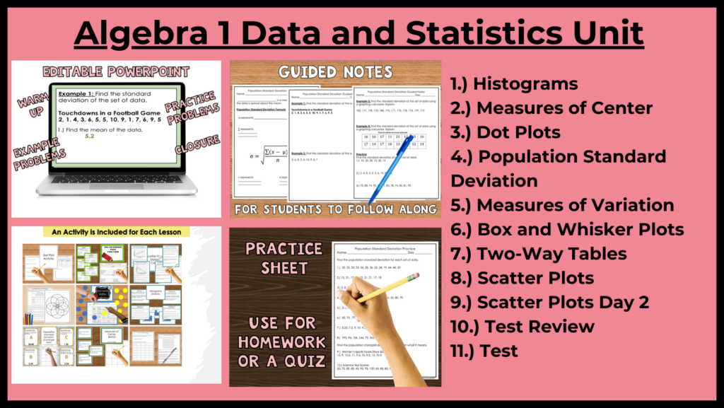
Mastering the 8th Grade Math Curriculum: Explore Ready-to-Use Math Units for Success!
Master Algebra 1 with these Engaging Time Saving Math Units!
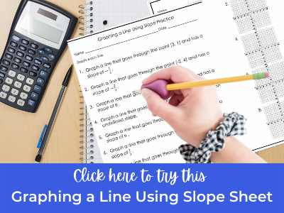
Click below for a Free Slope worksheet.